Your website is the “digital front door” to your business – it’s often the first impression for a customer.
Now picture your current website. What would someone think of your business right now?
It’s probably not the impression you want to make.
If your current site is outdated, slow, or confusing to navigate, these issues can cause potential customers to judge your business harshly. Even if these negative judgments are subconscious, they’re very real and can affect whether a customer trusts to do business with you.
Even if it feels like you “just redid the website” or think “our site is good enough” for your industry, you should consistently check in to see what you can update. Making small changes now can go a long way toward building trust online and winning more customers!
Does Your Website Fall Short in These 12 Critical Areas?
If it’s been a while since you updated your site, here’s 8 key areas to check:
1. Visual Design
48% of people find a website’s design the number one factor in determining a business’s credibility.
Further, it only takes about 50 milliseconds (0.05) for someone to form an opinion about your website and whether they’ll stay or leave.
In that first fraction of a second, users are taking in the visual design of your website. They’re looking at your colors, layouts, spacing, images, and more.
Look at your website now. Is that the first impression you want to give a prospect?
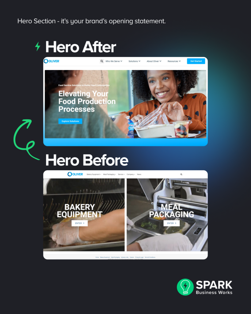
Here’s what the difference between poor and good visual design can look like next to each other:

Read about the full website transformation for Oliver Packaging here.
2. Branding and Messaging
Are your branding elements (such as logo usage, color palette, and typography) inconsistent across different pages? Does your website align with your current brand guidelines? Do you even have brand guidelines to follow?
Inconsistencies in branding can confuse visitors and dilute the impact of your brand.
Branding extends just beyond a logo or a catchy tagline. It also encompasses your messaging, or how you communicate and resonate with your target audience. Without the right messaging, you may fail to engage visitors and differentiate your business from competitors.
When branding and messaging work hand-in-hand, it forms a cohesive brand identity that reflects your unique value proposition, while fostering brand recognition, trust, and customer loyalty.
Not sure where to start with updating your brand? See how to create an effective brand style guide that outlines all the essential elements of your brand identity.
3. User Experience (UX/UI) Design
Once a user lands on your site, what action do they take?
Website visitors constantly have to make decisions on your site to get the information they’re looking for – what button to click, what section to scroll to next, or what fields to fill in.
Your job is to understand what your users’ goals are and then making it as easy as possible to reach them.
Your users could be trying to:
- Book an appointment
- Search your product catalog
- Buy a product
- Learn more about your services
- Contact your customer service team
- Look up the address of your business
But, poor UI/UX (user interface and user experience) design can make it frustrating and difficult for users to move around your website and meet their goals.
If you have a UI/UX problem, you might notice these tell-tale signs in your web analytics:
- Users quickly abandon your site before taking any action (like submitting a form)
- High number of page views, but no positive action (like filling out a contact form)
- Users make it to the checkout page, but don’t complete their purchase
- High abandonment rates on pages with important contact forms or surveys
Or, you might even hear direct feedback from clients about their frustrations! Clients might leave comments in your contact forms or even reviews. Be sure to act on these challenges!
When it comes to UI/UX design, there are all sorts of design best practices to follow (like Hick’s Law) that aim to help users interact better with your website. We recommend getting an assessment from a professional to understand how you can improve your site from a UX perspective.
4. Mobile Responsiveness
Have you ever tried to look at a website on your phone or tablet that was too difficult to read? It’s not fun and it probably altered your impression of the company you were viewing.
With over 50% of web traffic taking place on mobile devices, “responsive” design is not a nice to have, it’s a must-have if you want to reach your customers.
Mobile responsiveness is how a website responds to the size of the screen on which it’s being displayed. A responsive website adjusts itself so that it will look good on whatever screen size (desktop, tablet, phone) is being used.
But many websites are still not mobile-friendly today, and they’re losing potential customers because of it!
.png)
(The same goes for browser compatibility! Your site’s design and functionality should be compatible with various browsers like Chrome, Safari, Edge, and Firefox. A good web designer will help optimize your site for different browsers).
5. Web Accessibility
Web accessibility ensures that your website can be used and accessed by everyone, including individuals with disabilities. This encompasses various aspects of your website, such as:
- Including alternative text for images for those utilizing screen readers
- Ensuring proper color contrast for visually impaired users
- Making navigation possible for those who may have mobility impairments
- Text transcripts for audio content
Not only is it vital to prioritize web accessibility to provide equal access to information for all users, but it also ensures you comply with legal requirements, such as the Americans with Disabilities Act (ADA) and the Web Content Accessibility Guidelines (WCAG).
Legal issues aside, web accessibility is the right thing to do and can benefit your business in more ways than you think!
Check out our go-to guide on web accessibility and creating inclusive digital experiences to learn more.
5. Calls to Action (CTAs)
Your website should be action-oriented. It should invite users to take a specific action that will move them closer to a solution to their problem. Calls to action (or CTAs) could include filling out a form, making a call, requesting a quote, or scheduling an appointment.
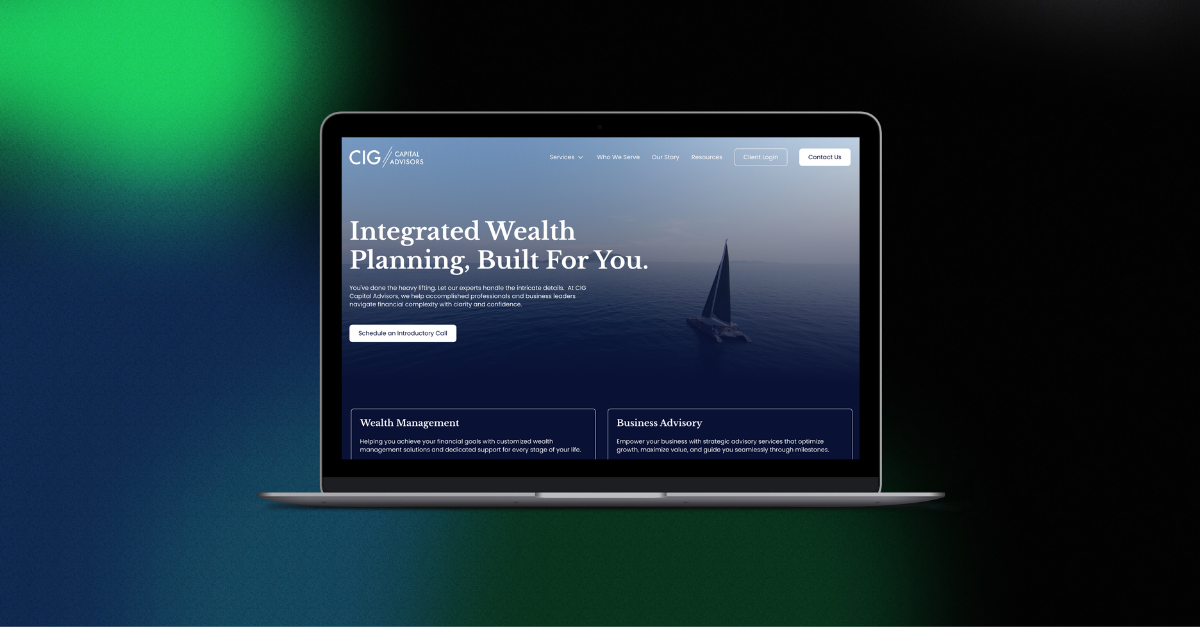
Here’s an example of two easy-to-find CTAs from a website refresh for a SPARK client:
.png)
To make your CTAs effective, you should give careful thought to their specific wording and design. If your website lacks CTAs entirely or your existing CTAs haven’t been effective for you (for example, no one contacts you after they visit your site), it might be time to update your website.
7. Search engine optimization (SEO)
SEO is the practice of making sure your website content ranks high in search engine results.
It isn’t a novel concept anymore– it’s more competitive than ever to rank on the top page of search results. Over the years, Google in particular has cracked down on any SEO “black hat” tactics that can cheat your way to the top. They’ve also added more paid ads, which means there’s less space for organic (or non-paid) search results to appear.
According to Advanced Web Ranking 2024, the first three organic positions for non-branded search earn more than 50% of the total click-throughs! For branded search, the numbers are even higher.
-1.png)
When it comes to SEO, you need to follow best practices. And, it’s much more than just having the right “keywords” on your web page. There’s other technical requirements that help boost your search rankings like:
- Having a mobile-responsive website
- Fast loading pages
- Keeping your Google My Business profile up to date
- Using Header Tags in your content
- Using meta descriptions for your pages
- Publishing fresh content consistently
Many of your ideal customers begin their quest for a solution to their problems by searching on the internet. When they do so, will they find your company? If not, it could be time to update your website to incorporate some better SEO practices.
If you want to learn more, Moz has an excellent beginner’s guide to SEO.
8. Page Load Speed
How fast your website is matters. 47% of people expect a site to load in 2 second or less. And 40% of people will leave a site that takes more than 3 seconds to load.
So, how do you speed up your site? Unfortunately, it’s a complex issue, especially if you’re trying to optimize an older site. All these different technical components below can impact your page speed:
- Clean code
- Design elements
- Hosting
- Content Delivery Networks
- Tracking / Analytics
- Use of third-party apps on your site
If your site is slow, you most likely need an update in the technology that’s powering your site in the background. You can test your current site speed in two ways:
- Click around the site yourself and be objective about the load times
- Use a free diagnostic tool (keep in mind results aren’t 100% accurate)
When it comes to page speed, you’ll most likely need the help of a web professional to get things in order.
9. Security Flaws
If you haven’t updated your website in a while, it may have one or more security flaws. These security flaws could provide a way for hackers to cause all kinds of damage to your business: theft of information and money, extraction of customer data, etc.
Bad actors are always finding new ways to exploit outdated websites. The companies that make software applications for websites are constantly updating them to prevent those security threats. But if your website is not being actively maintained, it won’t receive the benefit of those security updates.
By updating your website (and working with a provider you trust to maintain it), you ensure that your site and its data is secure.
Learn more about SPARK’s fully managed web hosting and support services. We ensure your website is fast and secure, with best-in-class network and security.
10. Messy Sitemap and Main Menu Navigation
When building or re-doing a website, one of the first activities is creating a sitemap. A sitemap is a file that lists all the pages on a website, providing a roadmap of a website’s page structure. It helps search engines understand the organization and hierarchy of the website’s content, making it easier for them to crawl and index the pages effectively.
(Not sure where your sitemap is? Ask your web developer how to access it.)
A messy sitemap, with an excessive number of blogs or other content cluttering the root directory, can lead to several negative consequences. Firstly, it can create confusion for search engines and make it harder for them to understand the site’s structure. This can result in some pages not being indexed or ranked properly in search engine results.
A clean and thoughtful sitemap can also help you organize your main menu on your website. It serves as a visual representation of how to group and sort pages into a clear hierarchy for users. A thoughtful main menu should help users find the specific content they’re looking for and take action. It can also lead to lower bounce rates and increased conversions.
11. Pages with Thin Content
Pages with low word count can severely impact the website’s performance, particularly in terms of SEO.
Search engines value high-quality, informative, and comprehensive content. Pages with minimal content provide little to no value to users and can be seen as thin or low-quality content by search engine algorithms. As a result, “thin” pages may have difficulty ranking well in search engine results or may be excluded from search results altogether. Yikes!
For users, pages with low word count can inherently lack the necessary depth and detail that users may be seeking, leading to a higher bounce rate and a negative user experience.
When updating your website, take an audit of your pages and update or remove pages entirely that don’t provide substantial or valuable content.
12. Outdated, Hard-to-Use Content Management System (CMS)
A top reason that companies reach out to SPARK to rebuild their website is having a content management system (CMS) that’s difficult to work with.
An overly complex or cumbersome CMS can hinder efficiency and productivity for internal teams. For example, the most common complaint we hear about an outdated CMS is that it’s difficult to make even simple changes like adding text to a page. In worst-case scenarios, some companies don’t have access to make ANY changes to their website without the help of an external developer!
This can result in delays, frustration, and potentially expensive reliance on external resources or developers for every small modification. This can severely prohibit your team’s ability to implement new features, design changes, or optimize your website effectively.
If this sounds like the struggles of your own team, it’s likely time to update your CMS to a more user-friendly and intuitive platform. A modern CMS can empower your internal team to efficiently manage and update the website, reducing reliance on external resources and enabling timely updates and improvements.
Choosing the right CMS for your business can be overwhelming with so many choices available! Work with the SPARK team to help compare and pick the best CMS for your website and business goals.
Before you update your website, what ROI should you expect?
When you update an outdated website, you should expect a solid return on your investment. Exactly how much of a return is difficult to predict.
But think about it…
- When you update the visual design of your site, you give a positive first impression, establish credibility, and make it much more likely that visitors will do business with you.
- When you update the user experience of your site, you’re making it easier for visitors to meet their goals and find the information they want.
- When you ensure browser compatibility, you know that your updated site looks good for all your visitors no matter what internet browser they prefer to use.
- When your site is mobile responsive, you ensure that your site is readable to the roughly 50% of visitors who are looking at your site from their mobile devices.
- When you have effective calls to action, you help your visitors engage with your company.
- When your site is SEO-optimized, you make it so your best prospects can find you easily.
- When your site loads fast, you won’t have potential customers abandon it before they take a positive action.
- When your site is free of security flaws, you have protected your business and customers from potentially serious threats.
All of these, when added together, result in considerable ROI (even if exact numbers are difficult to calculate).
Ready to update your website?
The bottom line is that your website is an important business asset. It can (and should be) a hardworking ambassador for your company generating goodwill, positive first impressions, leads, appointments, sales, etc. But, it can only be that for you if it’s updated to meet your customers’ standards.
Want some help figuring out if your current site can use an update? We’ve got you covered- reach out to our team today!
Here are more website design resources you could find helpful:


